
Remember studying for that high school math test and wondering why you had to learn stuff that you would never use again?
Well, surprise! It turns out that math is at the very heart of the sailing experience. Indeed, your Leopard is essentially a massive collection of calculations and equations slicing through the water.
TSW, TWA and VPP
Perhaps the most helpful bit of seafaring math to understand is your Leopard’s polar diagram. A polar diagram shows how fast a sailboat could potentially travel at different wind speeds (TWS=True Wind Speed) and various angles to the wind (TWA=True Wind Angle). Every sailboat model has a unique polar diagram, which displays the results obtained using a velocity prediction program (VPP) based on the craft’s weight, hull shape, rigging and sail setup.
You can find your Leopard’s polar diagram below:
The calculations represented in your boat’s polar diagram are a powerful tool for charting a course, estimating passage times, and choosing your sail plan for maximum efficiency.
Choosing the Right Sail
“The polar is an excellent way to answer the question, should I still be sailing with a jib, or should I switch to a spinnaker or a reacher,” says yacht designer and naval architect Alexander Simonis. “Everybody knows that when you sail downwind, the jib is not that efficient. You go to a spinnaker, an asymmetric spinnaker, a gennaker, as a downwind sail. But when you want to know something more specific, such as, what sail is best on a reach in 25 knots of wind? Or should I switch now to another sail? That’s where the polar can help.”
Following the Polar Diagram Correctly
While a polar diagram can look daunting at first glance, it’s actually pretty simple to follow.
A polar consists of three data indicators: straight lines, circles and curves. The straight lines that radiate out from the center represent the True Wind Angle (TWA). The circles, which also spread from the center, represent boat speed through the water (STW).
The colored curves, overlaid on the grid created by the straight lines and circles, plot the boat’s predicted speed at various combinations of TWS and TWA. The colors represent different sail plans.
The diagrams are usually divided into upwind and downwind sections.
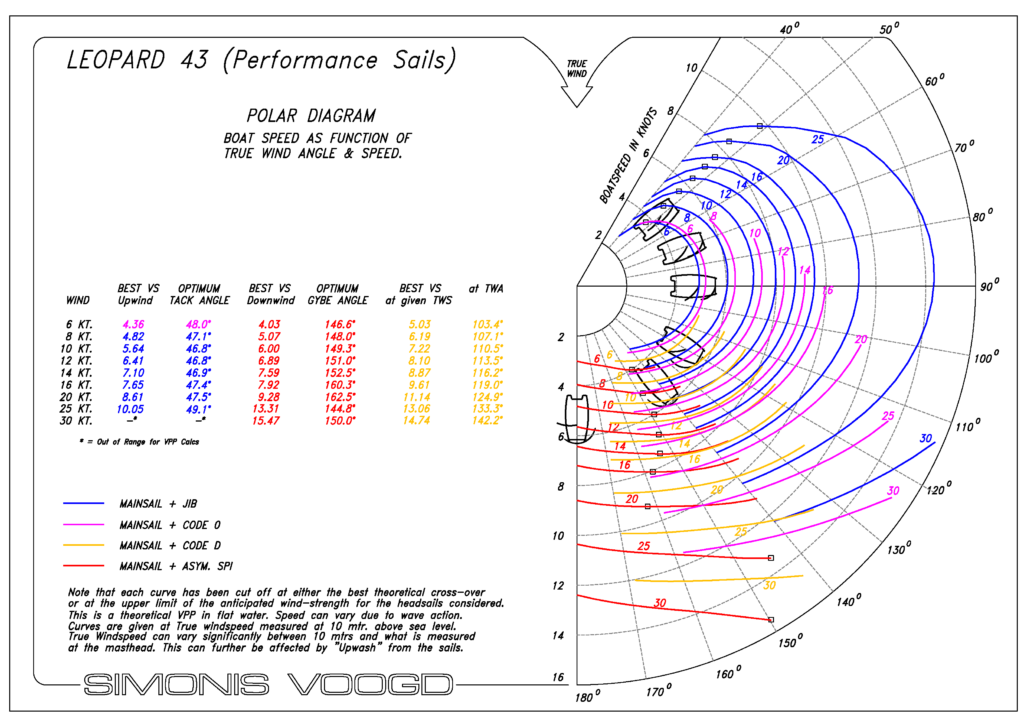
To read the Leopard 43 polar diagram shown here, start by looking at one of the colored curves, such as the blue line, which represents the mainsail and jib sail plan. Each blue curve corresponds to a different true wind speed (TWS). As you follow a curve around the diagram, the angle from the center shows the true wind angle (TWA) while the distance from the center indicates the boat’s predicted speed. For example, in 20 knots of true wind with the mainsail and jib, the Leopard 43 is predicted to sail at approximately 6 knots around 50° TWA, increasing to roughly 7 knots near 90° TWA before gradually tapering off as you sail deeper downwind.
If you’re not making those speeds, your sails may need to be trimmed.
Keep the Data Close
The velocity prediction data displayed on a polar diagram can also be presented in table form. One way to get maximum use from data is to laminate a copy of your VPP table and post it near the helm for quick and easy reference.
According to Simonis, the popularity of using polar diagrams has only recently increased with recreational sailors. Why? Maybe it’s another example of how we’ve come to embrace the power of data in our lives.
Or maybe math teachers are just doing a better job of selling their subject.